


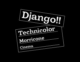
For this typeface, I created an updated and more modern take on the traditional slab serif. Something that was in between Clarendon and Rockwell, with the general structure and build of Rockwell but with some of the more curvier aspects found in Clarendon. For inspiration, I looked at western cinema and Italian typefaces of the 1960s. I would imagine this appearing on signage or in situations where bold readability is required. This initial iteration, Django Bold, is still an ongoing work-in-progress. A light weight is in-progress to flesh out Django and create a small font family.
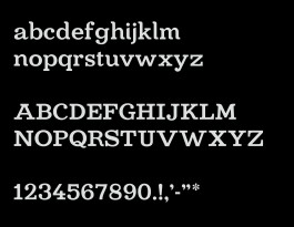
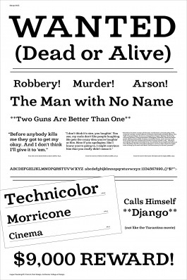
A specimen poster was designed to help communicate all of the best features of my typeface. I continued with the western theme by taking cues from wanted posters as well as quotes from different spaghetti western movies to show the typeface functioning at different sizes.
Saatchi & Saatchi & Toyota
[Full-time, 2020 – 2024]
Hypothesis
[Internship, 2017]
TOP
© Logan Vandergrift 2026