


The Hyperloop is a proposed mode of high-speed public transportation put into motion by Elon Musk. When constructed, it would function through the principles of air pressure and vacuums to rapidly shoot pods from one station to another. As of the date of publishing (2018) the Hyperloop has yet to be constructed, but many companies have began development and testing on these systems.
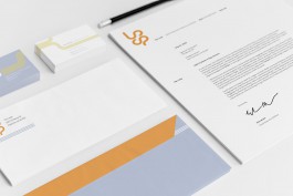
Branding unverified future technology presents challenges. How can an identity help to make the public feel at ease and accept an otherwise confusing and technologically-driven service? With this project, I gave a friendly and approachable identity to a company that could seem scary or dangerous through the use of lively colors and fluid dynamic logo forms.
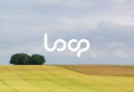
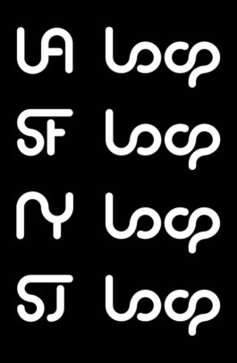
Several different rounds of sketching, by hand and then on the computer, were utilized before landing on a final logo. Because this is future forecasting for a non-existent company, certain liberties were allowed with the name (shortening from Hyperloop to Loop).


The inspiration behind the logo comes from how air moves through a controlled system when its pushed, pulled, and forced in every direction. The fluid nature of air is communicated in the graphic forms as well as how it can play out in an animated fashion.

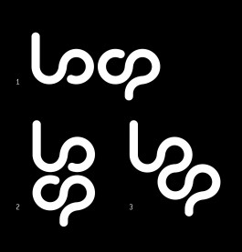
A modular solution was devised to afford maximum versatility across the brand:
1. Used most frequently, read horizontally from left to right
2. Used where the logo doesn't fit well horizontally (letterhead, uniform, etc.)
3. Used rarely, closest to illegible, a flexible decorative element
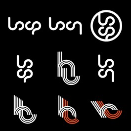
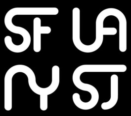
Different icons were created with the different possible stations in mind (represented proposed locations are Los Angeles, San Francisco, New York, and San Jose). More logos can be created in the same style as needed.

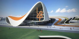
Since this mode of transportation doesn't exist yet, liberties were taken with the potential station mockup. The Heydar Aliyev Centre in Baku, Azerbaijan designed by famous architect Zaha Hadid was utilized to show how color and signage could be displayed on the exterior of a station. The organic shapes of the building reflect the organic nature of the logo and graphic elements.

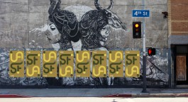
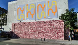
Two different sets of promotional posters were designed in the same style but for different cities. The logo and copy are jogged between the top and bottom of the posters to create a more interesting display when placed in multiples.



Saatchi & Saatchi & Toyota
[Full-time, 2020 – 2024]
Hypothesis
[Internship, 2017]
TOP
© Logan Vandergrift 2026